From a young age Steve Simmerman has been interested in archaeology, and how graphic design has informed cultures from the translation of the Rosetta Stone to the age of digital apps. Much of his work addresses the gimmicks of advertising and its power of persuasion, and he attempts to capture a collusion of nostalgia and mysteries of the passage of time. Simmerman’s dual interests in writing and design informs his aesthetic strategy. That is, he creates what he likes to call “narrative art,” where stylized illustrations merge with typography to enhance the subject matter.
Simmerman often pairs drawings of diverse human beings with selections of text, hoping to achieve unexpected connections with the verbal and visual content. These include children engaged in cheerful play, old men discussing the latest concerns of the day, and couples whose social milieu seems frozen in a time machine. Among the artists Simmerman counts as inspirations are Henri Toulouse-Lautrec, Edward Hopper, and Jacob Lawrence. He admires the work of Andy Warhol and Jasper Johns and how they parlayed elements of commercial art into their paintings and sculpture. He’s also a huge fan of early magazine illustrators like N.C. Wyeth and Will Bradley, as well as poster designer Lucien Bernhard.
Simmerman’s work is primarily mixed media: acrylic, watercolor, oil pastel, or ink, then layered with “found” type. Exploring the synthesis of hand-drawn sketches and intertextuality, he enjoys discovering many routes towards visual storytelling. He currently teaches graphic design at Concord University.
Artist’s Statement
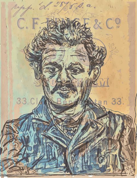
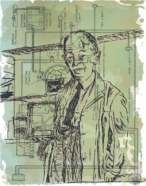
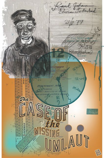
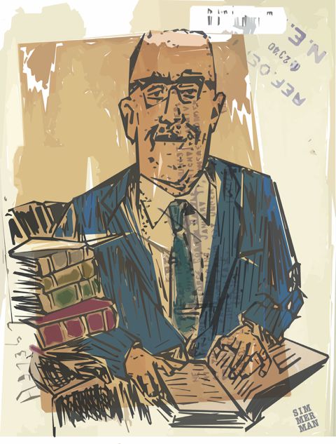
My four illustrations feature individuals who lived and worked in a different era, but who I found interesting because of the environment in which each worked. One was a southern judge, another a scientist or engineer type, and one appeared to be a soldier in World War II. The youngest lad, chosen for the “Case of the Missing Umlaut” poster, was referenced from a turn of the century mugshot. Most of my work is laced with layered elements like numbers and letters, to establish a sort of textural vibe while hopefully urging the viewer to make connections with the imagery and text.